

09/14/2013 by Joan Waddell 0 Comments
FRIDAYfinds! – FASHION COLOR REPORT for SPRING
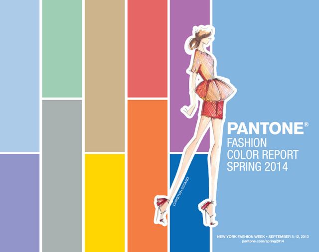
Pantone, the global authority on color,
unveiled their Spring Color Report recently to coincide with
New York Fashion Week.
Why am I interested in this?
As I’ve talked about before,
"FASHION AND FURNISHINGS
ARE CLOSELY ALIGNED"
What we see on the runway now, will make its way
to the world of interior design in the very near future.
In fact, much of this Spring palette is already showing up
on fabric lines I have seen from my reps.
Leatrice Eiseman, the Executive Director of
Pantone Color Institute, described the Spring colors like this,
"This season, consumers are looking for a state of thoughtful, emotional
and artistic equilibrium"
And the designers are having some fun mixing it up, pairing the soft pastels
with vivid brights to create a colorful balance, or "equilibrium" of their own.
| Courtesy of Pantone Color Institute-Whitney sketch |
Just reading the color names, conjures up images of blooming flowers,
and travels to exotic places…
Placid Blue
Purple Haze
Comfrey
Paloma
Sand
Freesia
Cayenne
Celosia Orange
Magenta Purple
Dazzling Blue
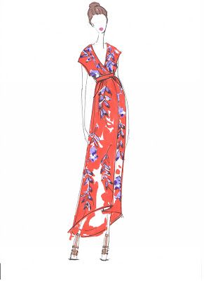
| Courtesy of Pantone Color Institute-Sachin+Babi sketch |
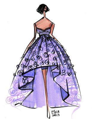
| Courtesy of Pantone Color Institute-Rachel Roy sketch |
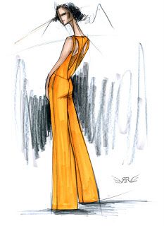
| Courtesy of Pantone Color Institute-Emilio Sosa sketch |
How will these refreshing new colors show up in my industry?
It will be fun to discover…
and I’m sure they will be up front and center
at High Point Market in October!
So stayed tuned for the latest,
as I dig a little deeper into this color trend.

Comments
Leave a comment